—
Case Study
Expedia Group: Partner Central Rooms and Rates Overview
Strategy / UX / UI Design
—
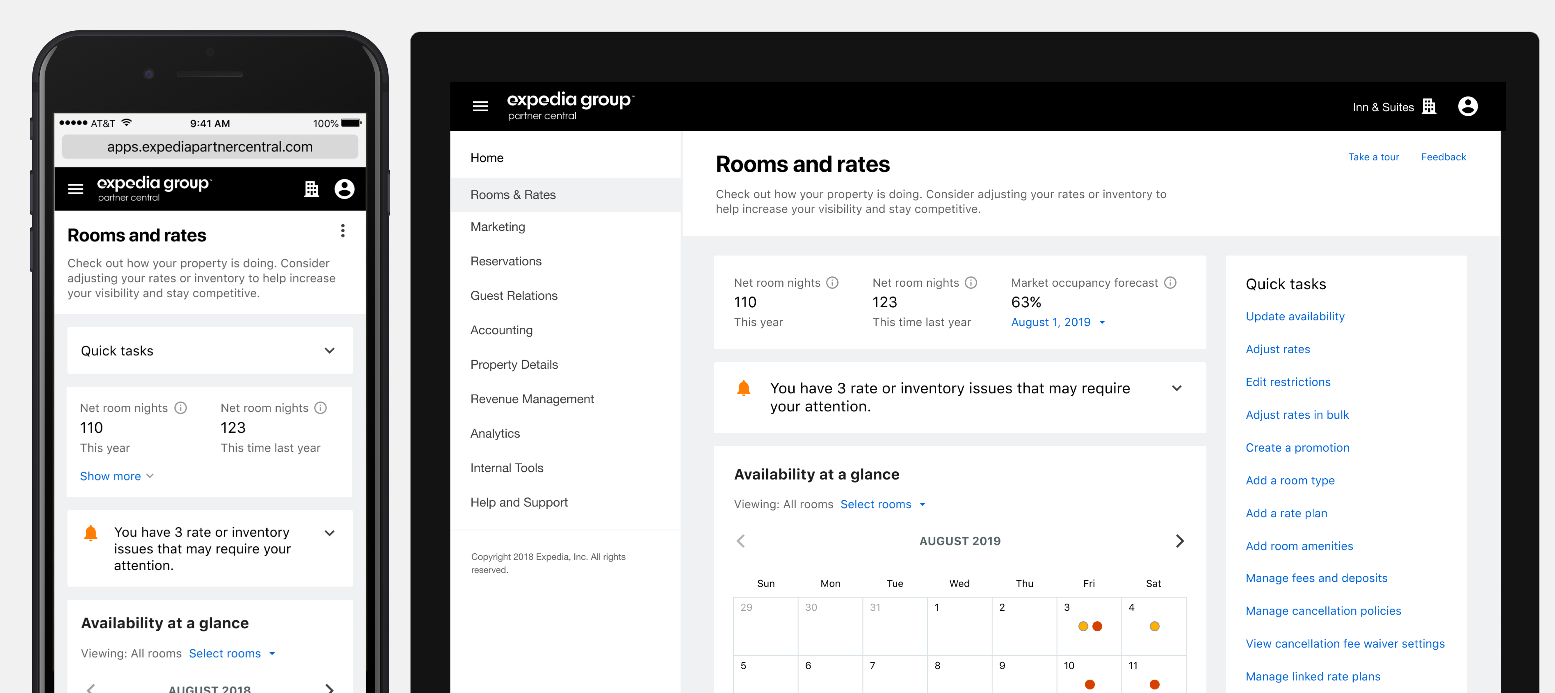
Goals
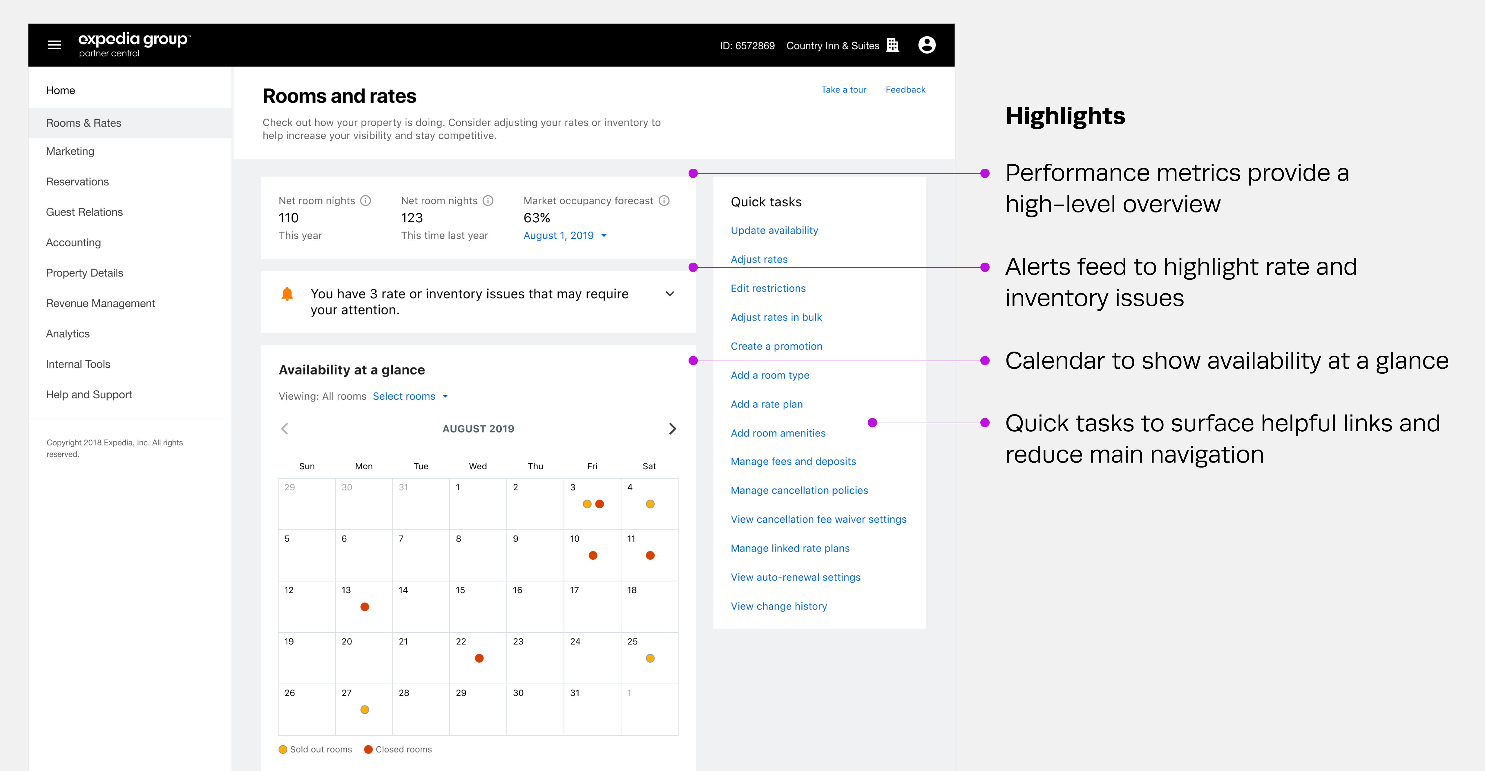
In order to provide diagnostic information, surface opportunities, and improve discoverability of tools within a key section of Partner Central, we sought to create a central hub that would simplify navigation and improve task completion.
My Role
As a Lead UX Designer, my role included close collaboration with content strategists, product managers, researchers and engineering teams in order to develop a strategic, long-term direction for the entire rates and inventory management space. I was responsible for wireframing, prototyping, and visual design.
Approach
In order to address the top pain points partners had with managing their rates and availability in Partner Central, I pulled from past user research and usability studies as well as direct partner feedback.
Process
Working with content strategy, I quickly created two prototypes that we could put in front of partners in order to validate ideas and get directional input.
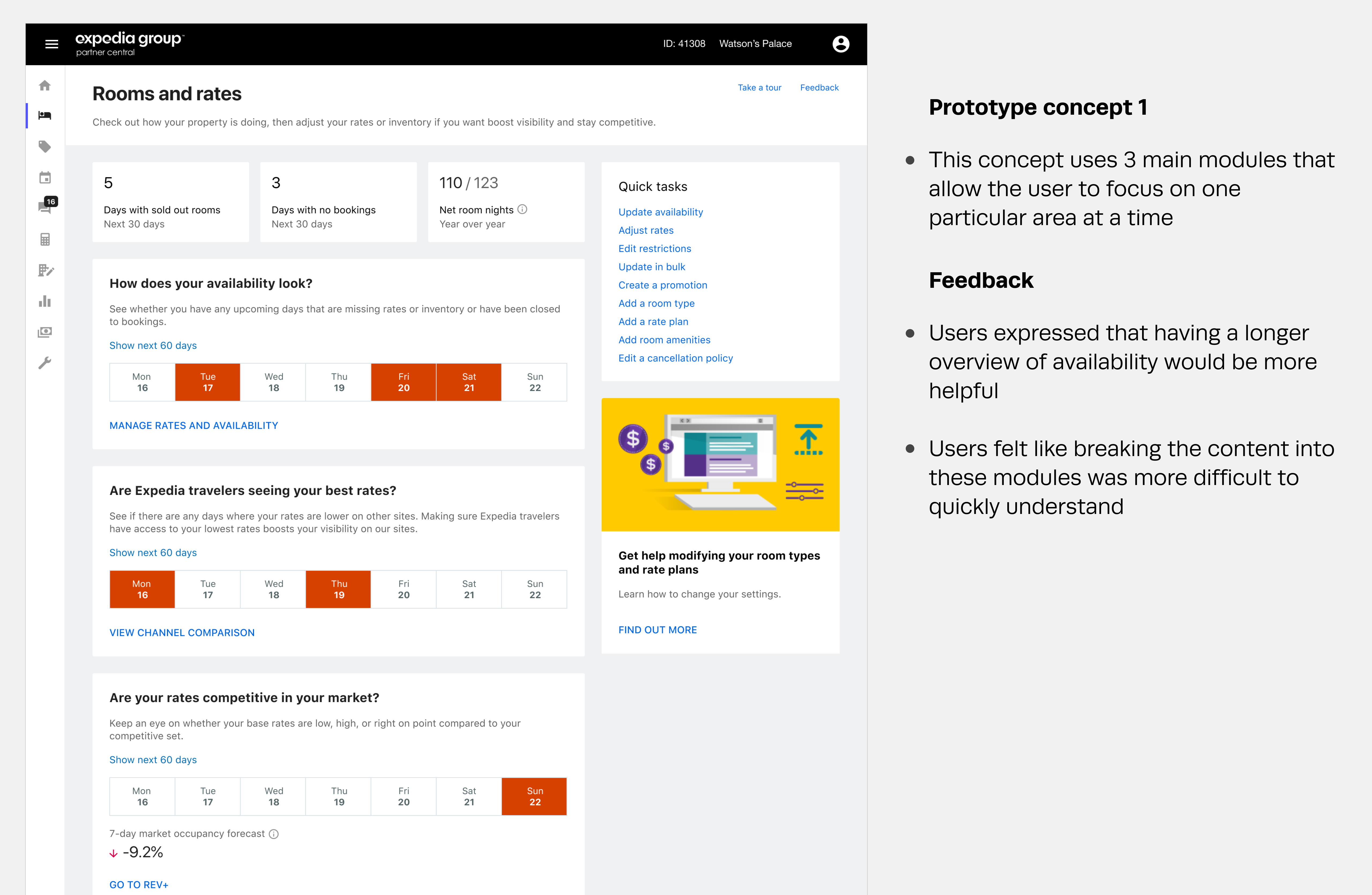
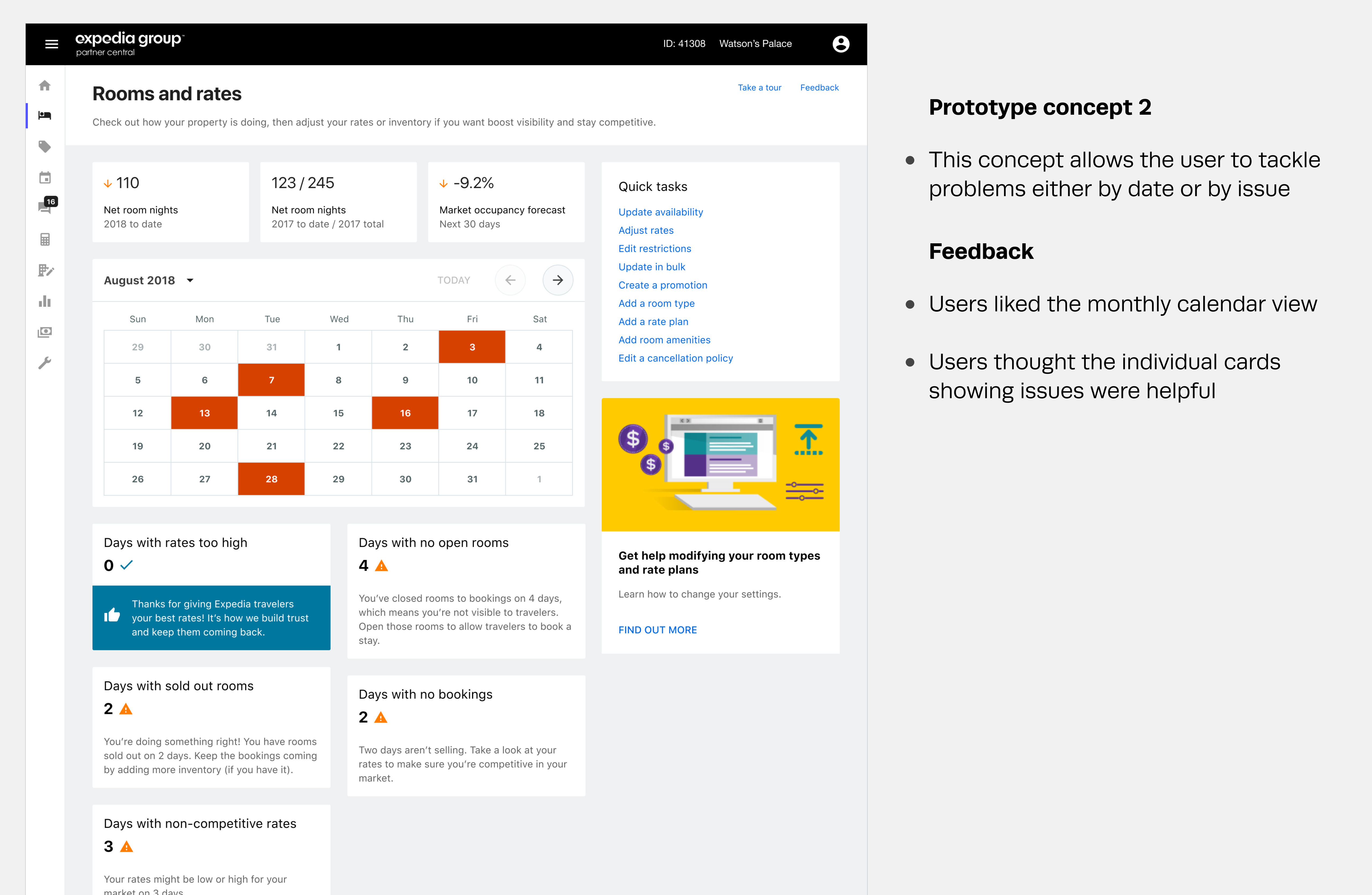
With concept 2 being the preferred direction, my next step was to refine what information would be displayed as well as how I could make the page be more of a quick read.
Design
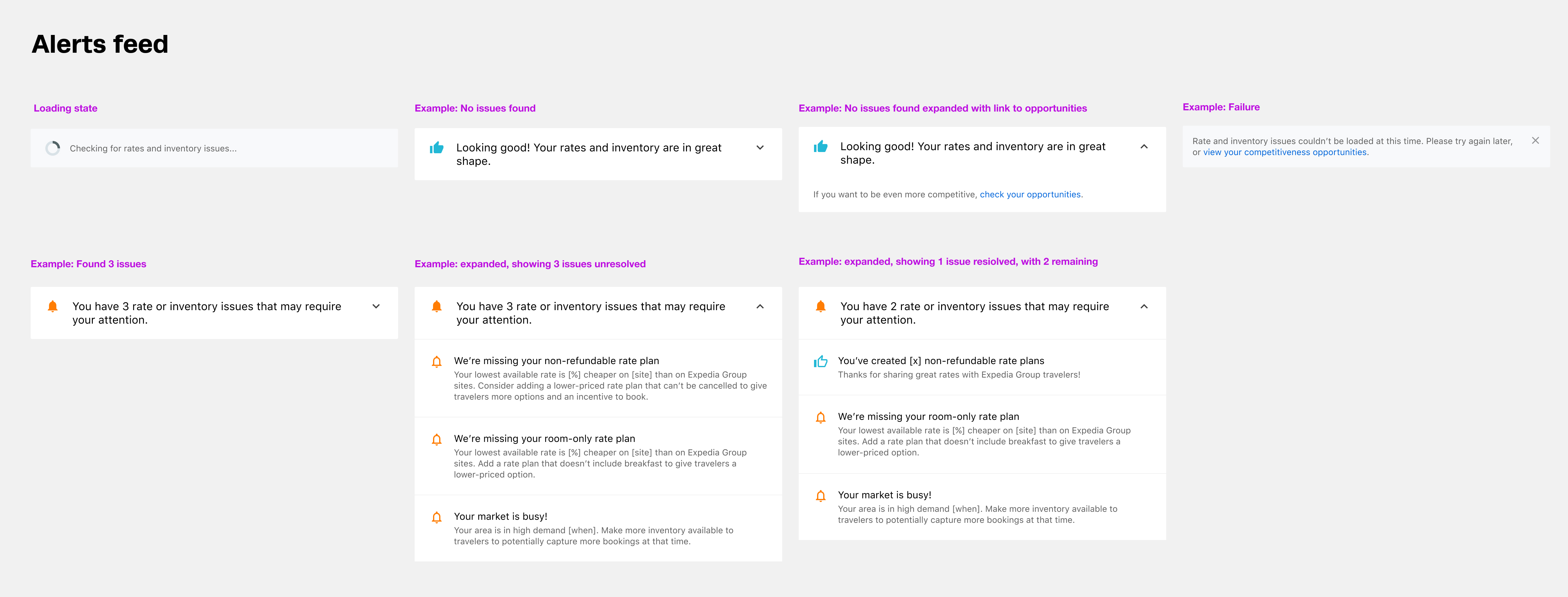
We knew from other pages that partners often developed “card blindness”, resulting in helpful suggestions being ignored. So for other rate-related issues, I created an expandable module that would allow us to quickly show any number of actionable alerts.
Results
• Increased partner actions taken to resolve inventory-related issues (3 times higher success rate than previous patterns and placements for similar alerts)
• Simplified main navigation and improved discoverability of tools, resulting in improved ease-of-use scores and higher engagement
• Introduced effective new pattern for alerts and on-page actions to the design system