—
Expedia Group: Partner Central Automatic Rate Renewal
Bringing clarity and control to pricing updates
Goals
For the automatic rate renewal redesign, we sought to give partners more control over and more visibility into the rate updates being made on their behalf in order to improve opted-in partners’ engagement with the tool and reduce the risk of payouts.
My Role
As a Lead UX Designer, my role included close collaboration with content strategists, product managers, researchers and engineering teams in order to develop a strategic, long-term direction for the entire rates and inventory management space. I was responsible for wireframing, prototyping, and visual design.
Approach
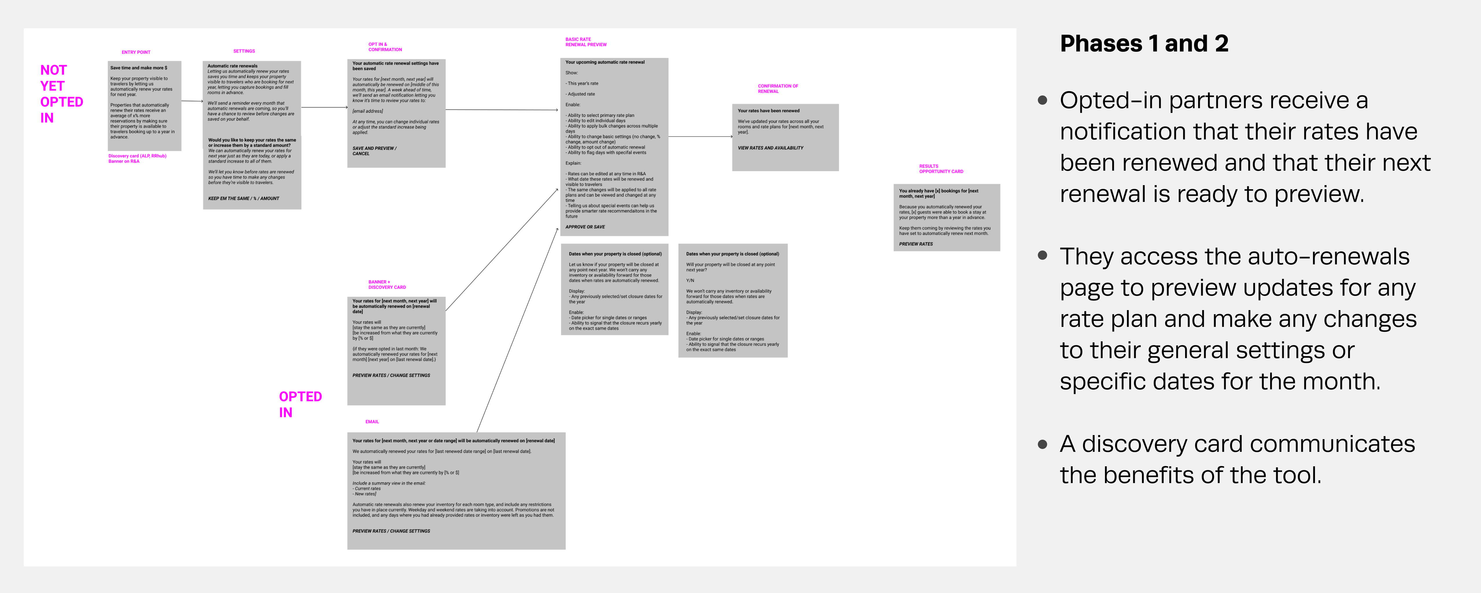
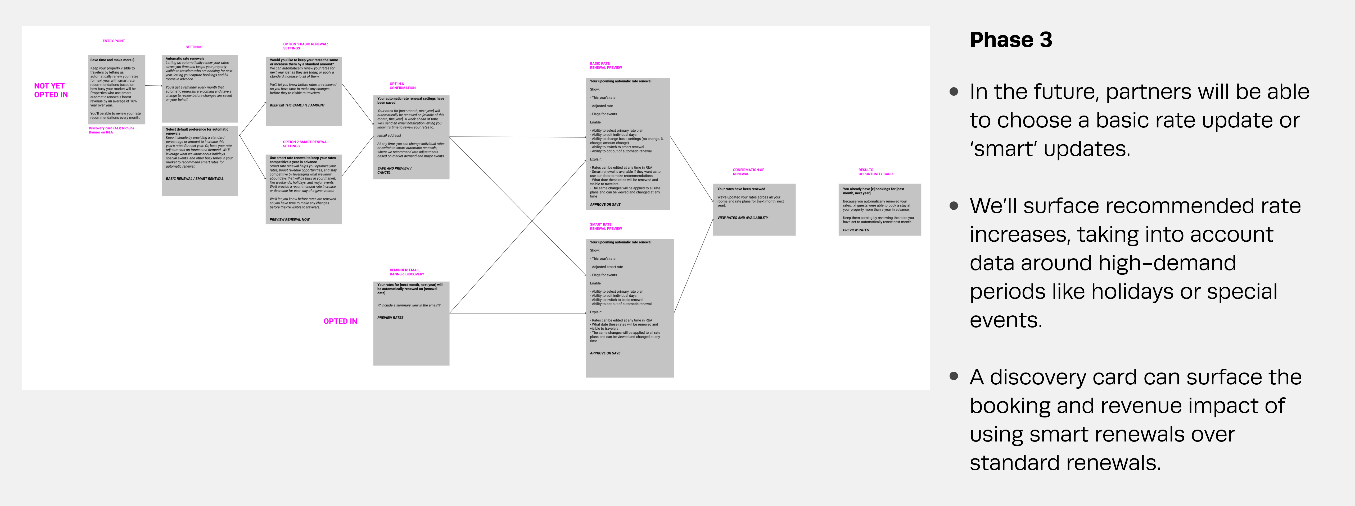
Utilizing previously gathered partner feedback regarding automatic rate renewal, I worked directly with a content strategist and product manager to develop a phased approach that would quickly deliver value to users.
Process
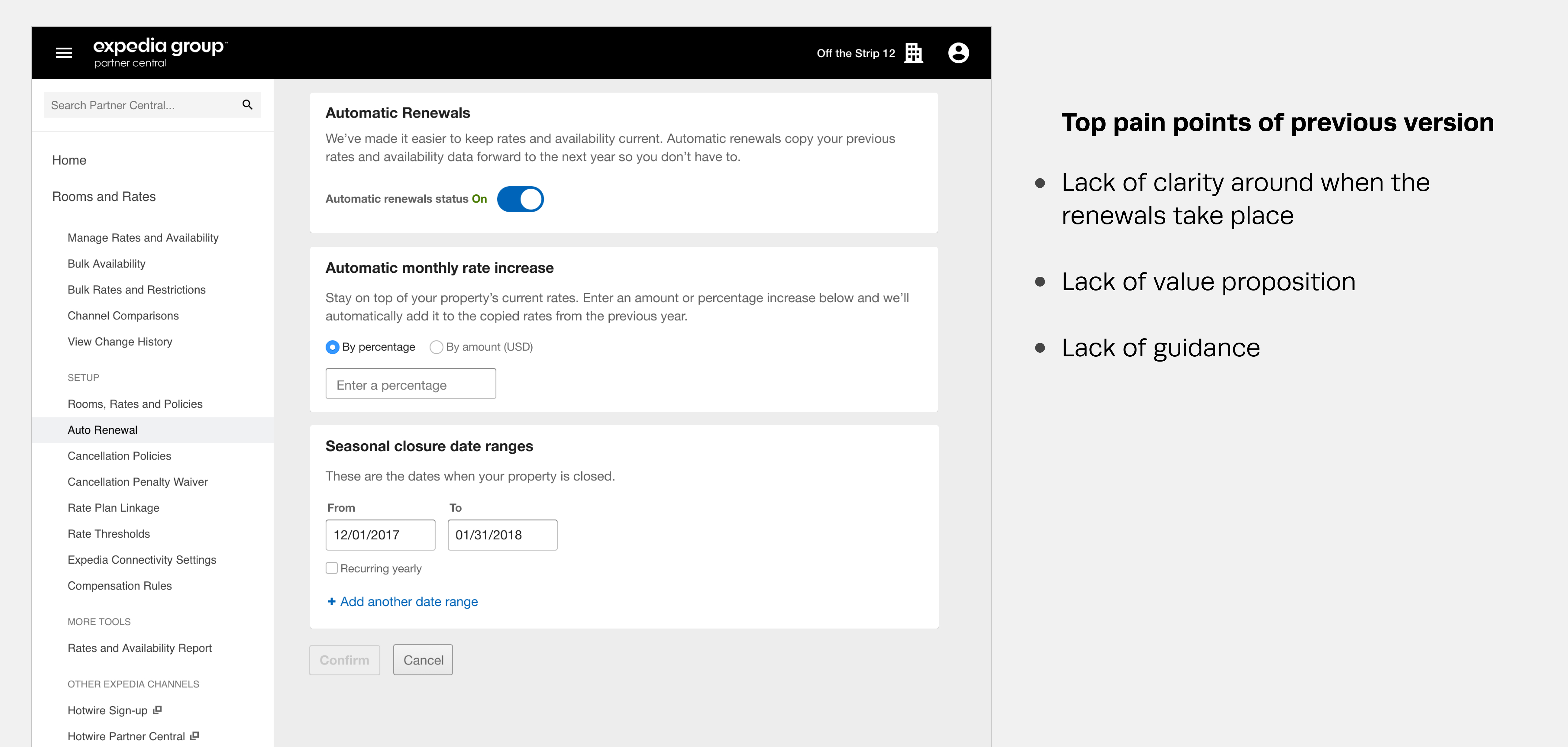
When testing an initial concept with users, we discovered that the motivation for turning on automatic renewal was not clear enough, creating significant confusion later in the process regarding the start and end dates and its impact on rates and plans.
Design
After taking a step back and re-evaluating the initial concept, I made the following changes:
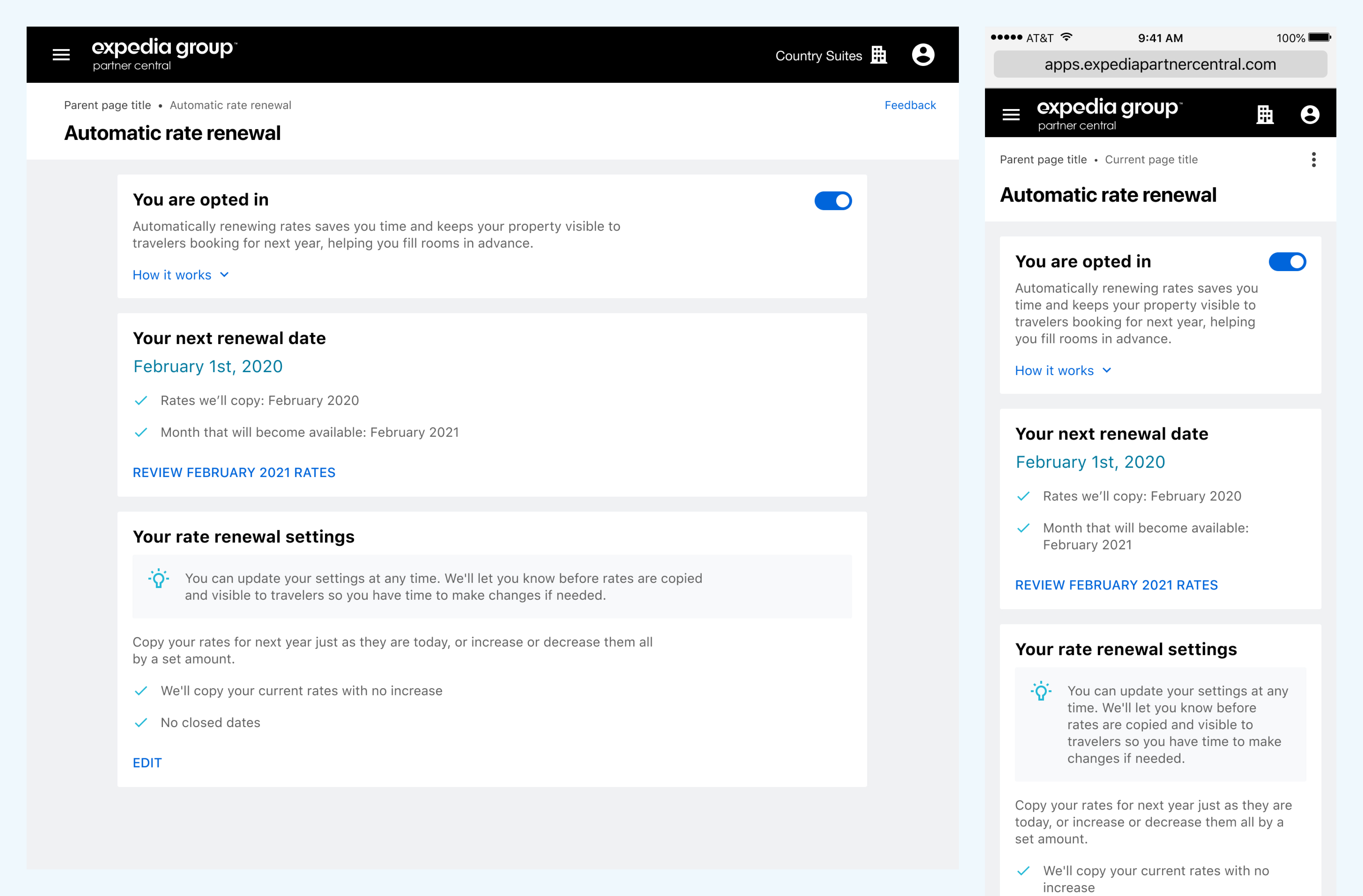
• I revised how the information on the page was organized, making for a clearer playback of relevant renewal dates and settings.
• I provided a “How it works” section to answer any questions partners may have.
• I removed the editable preview grid as it was a case of the page trying to do too much. Instead, I added a link to the rates and availability page.
Results
Although my time ended with Expedia prior to the launch of this re-design, initial feedback from both partners and internal users (Market managers) has been positive.