—
Expedia Group: Partner Central Rates & Availability
Streamlining a complex property management workflow
Goals
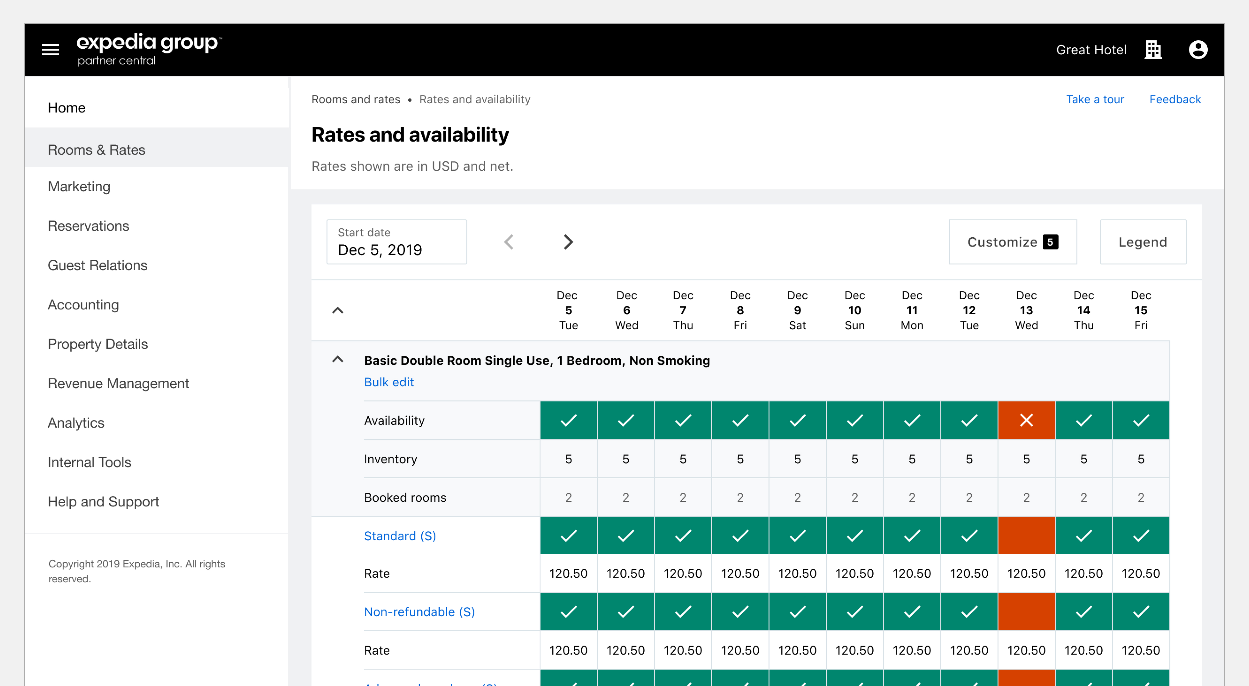
Managing rates and availability is a core task for lodging partners when using Expedia Group's Partner Central application. By improving the experience around this and related tasks, we sought to reduce customer service calls, improve time to interaction, and increase overall customer satisfaction.
My Role
As a Lead UX Designer, my role included close collaboration with content strategists, product managers, researchers and engineering teams in order to develop a strategic, long-term direction for not only the “Rates and availability” page, but for the entire rates and inventory management space. I was responsible for wireframing, prototyping, and visual design.
Approach
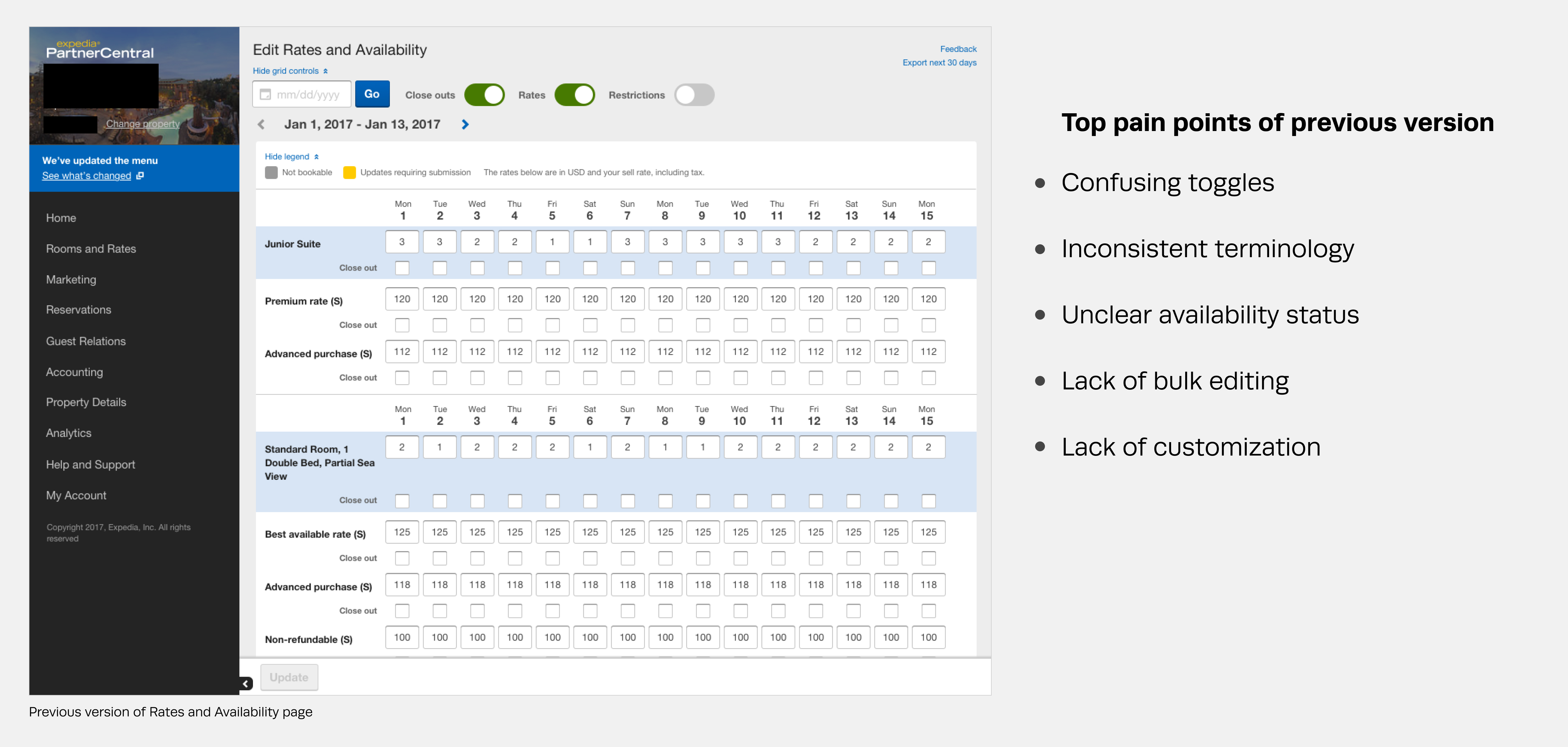
Going into this project, we had a wealth of previous feedback from partners, suggestions from internal users (Market Managers), and past usability studies from which to draw. I began by looking for improvements that could be made incrementally, while working on a longer-term plan.
Process
Knowing that a new design system for Partner Central was in the works, but wouldn’t be ready to use for months, I took that as an opportunity to slowly introduce a more refined experience to our partners.
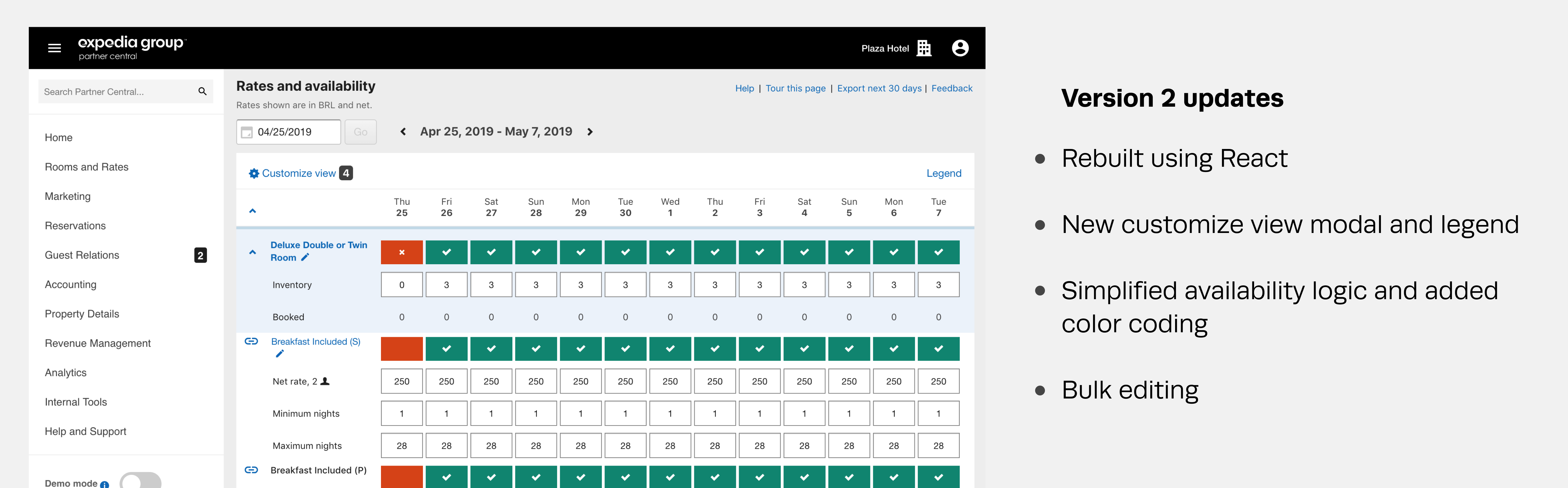
Working with engineering, we developed a plan to move the page to a React framework, which would help improve time to interaction. Since the page would be completely rebuilt, I was able to simplify multiple aspects of the experience, including the logic behind the core task of opening and closing rooms.
Design
In order to eventually adopt our new design system that was in the works, I made every effort to ensure that the transitional design would easily translate.
Results
With the new experience, we increased the user's ability to self-service, resulting in 30% fewer calls per month. Time to interaction (TTI) went from ~8 seconds to ~4 seconds, and we saw a dramatic decrease in negative feedback from partners.