—
Soundcheck: Concert Discovery App
A sound-first way to discover concerts
Business Challenge
Our objective was to create a go-to concert browsing app that would help users discover artists and purchase tickets to events they might not otherwise have known about.
My Role
I led the experience and visual design for Soundcheck, including product concept/ideation and naming, prototyping, and setting up and conducting user-testing sessions. I worked directly with product managers and developers, as well as key stakeholders to ensure we maintained a user-centric approach and stayed goal-focused and not get carried away with an over wrought feature set.
Approach
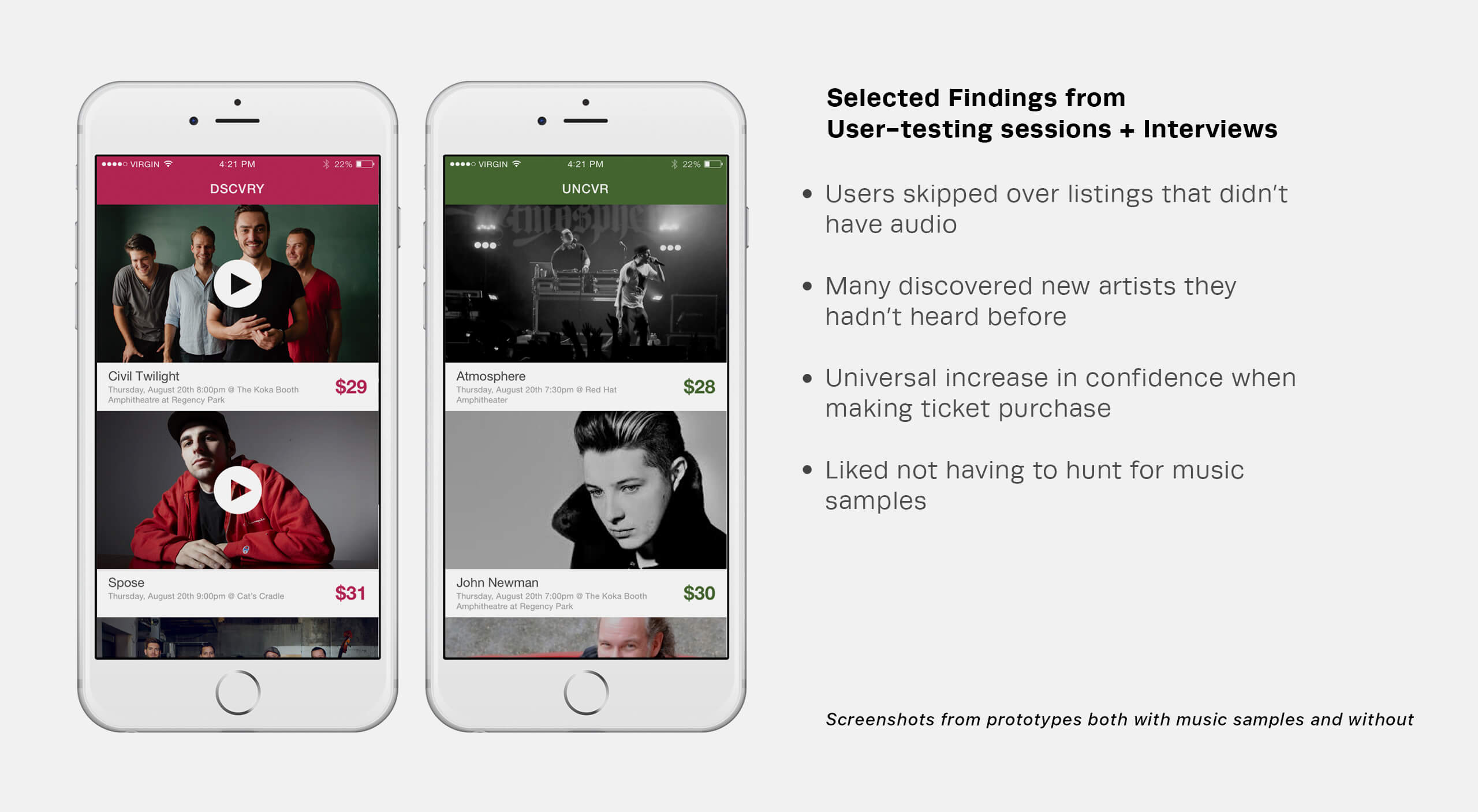
After examining existing data from the Ticketmaster app and analyzing competitor apps, we discovered that audio associated with upcoming concerts was usually buried multiple screens deep (if it was there at all) and had poor engagement. We then developed our hypothesis: By surfacing relevant media (ie, photos/audio) upfront, the user would be engaged in a more meaningful browsing experience and thus feel more confident in making a ticket purchase.
Process
In order to validate our hypothesis, we conducted a short design sprint and created simple prototypes to put before users. The testing sessions and user interviews made it clear that our ideas were sound, so with the direction in place we began the initial design explorations.

Design Challenge
Our design objective was to create a focused experience that would encourage browsing and exploration.
Research
Knowing our concept hinged on having artist images and music samples, our first task was to determine a source for this data. Our initial partner fell through halfway through the project, but despite this setback we were able to secure the needed data via Spotify's public API. Developer resources were also shifted around which meant we would only be creating an Android version to start.
Details
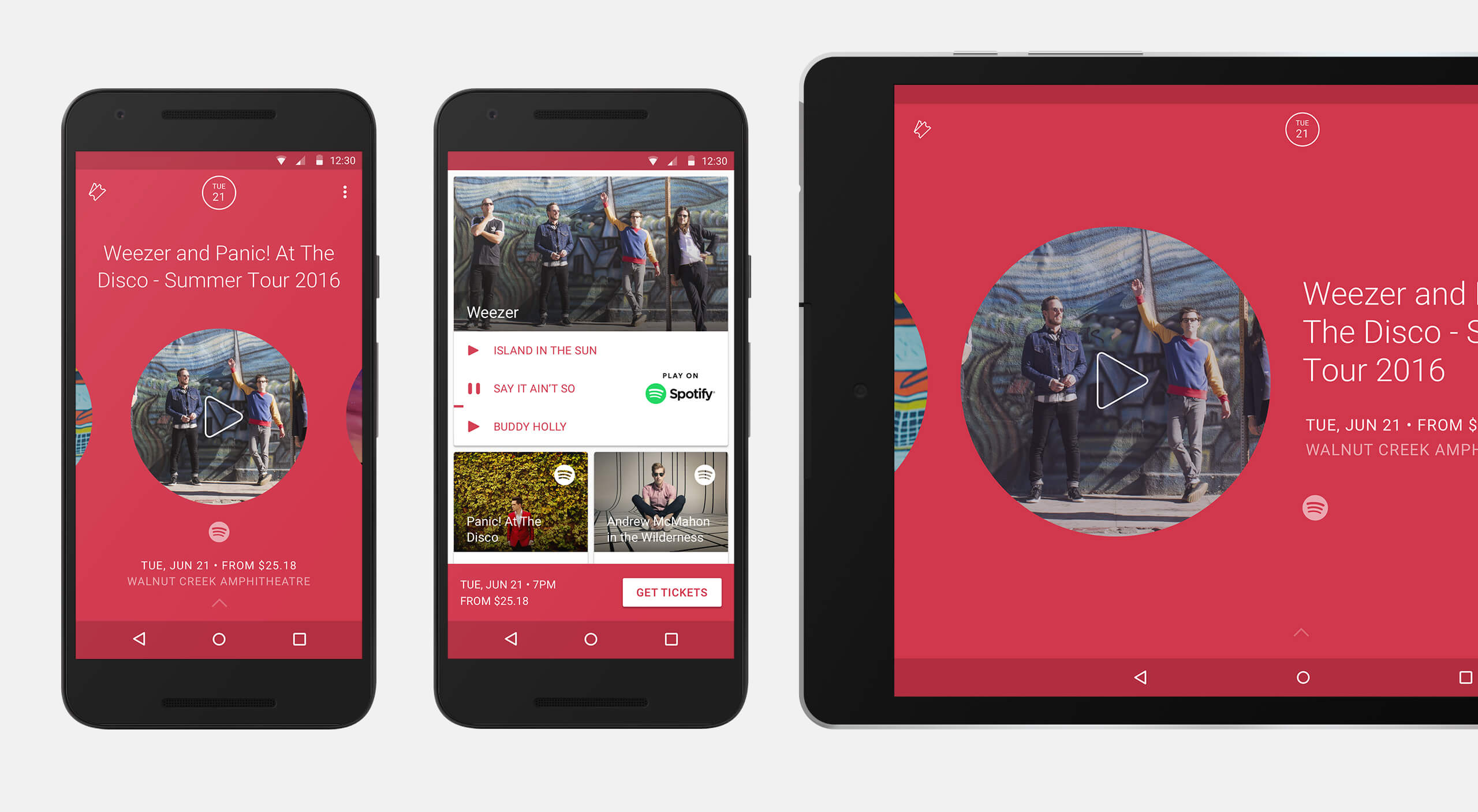
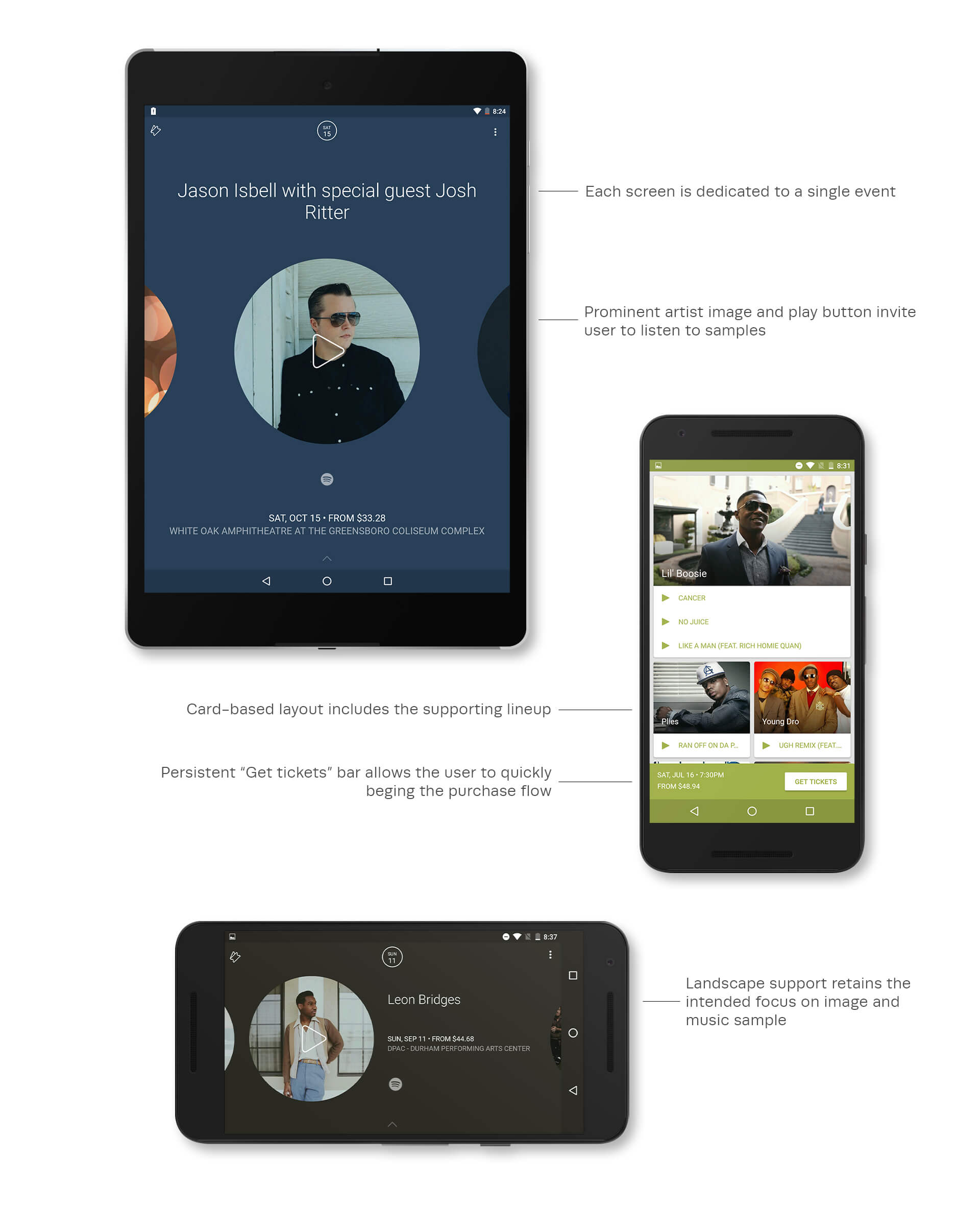
In order to encourage browsing, each screen is focused on a single event. Each event has a specific color which is derived from the artist image, while the prominently placed play button encourages sampling of the artist's tracks.
I worked with members of Spotify's legal and design departments to make certain that we gave proper attribution for imagery and music throughout the app.
Successes + Setbacks
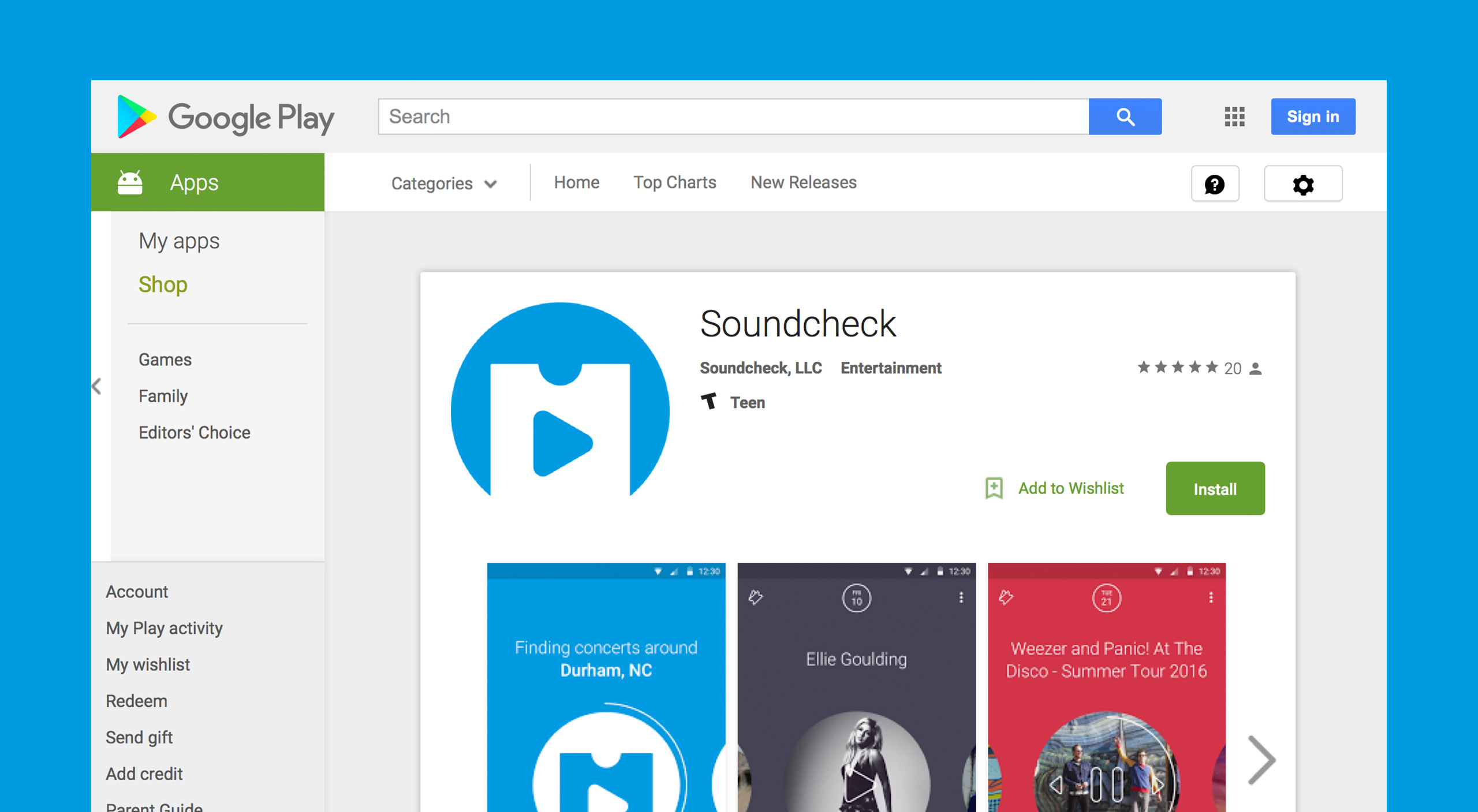
The internal beta provided useful feedback that enabled us to further tweak the design before launching on the Google Play Store.
Due to circumstances beyond the control of our team, the launch of the app was delayed numerous times. When we were finally given the green light, it came with certain caveats that didn't allow us to do the proper marketing that it takes in order to grow a suitable user base from which to learn.
Soundcheck has received nothing but good reviews on the Play Store, making me very proud of the work my team did.
