—
Ticketmaster App
Helping fans discover more of what they love, faster
Business Challenge
Our goal was to create a new experience that would increase engagement within the Ticketmaster app while providing new ways to identify the user.
My Role
As a Senior Product Designer, my role involved everything from planning the initial design sprint and user-testing sessions, to developing the overall aesthetic of the re-design. I was the lead designer responsible for the Discovery aspect of the new experience.
I tackled the iOS re-design while overseeing a junior designer who worked on the Android version.
Approach
In order to align the team around a new concept for the core app experience, the project kicked off with a week-long design sprint that included key stakeholders, product managers, and lead designers and developers. Insights into the current app's performance were shared, as well as data about usage patterns.
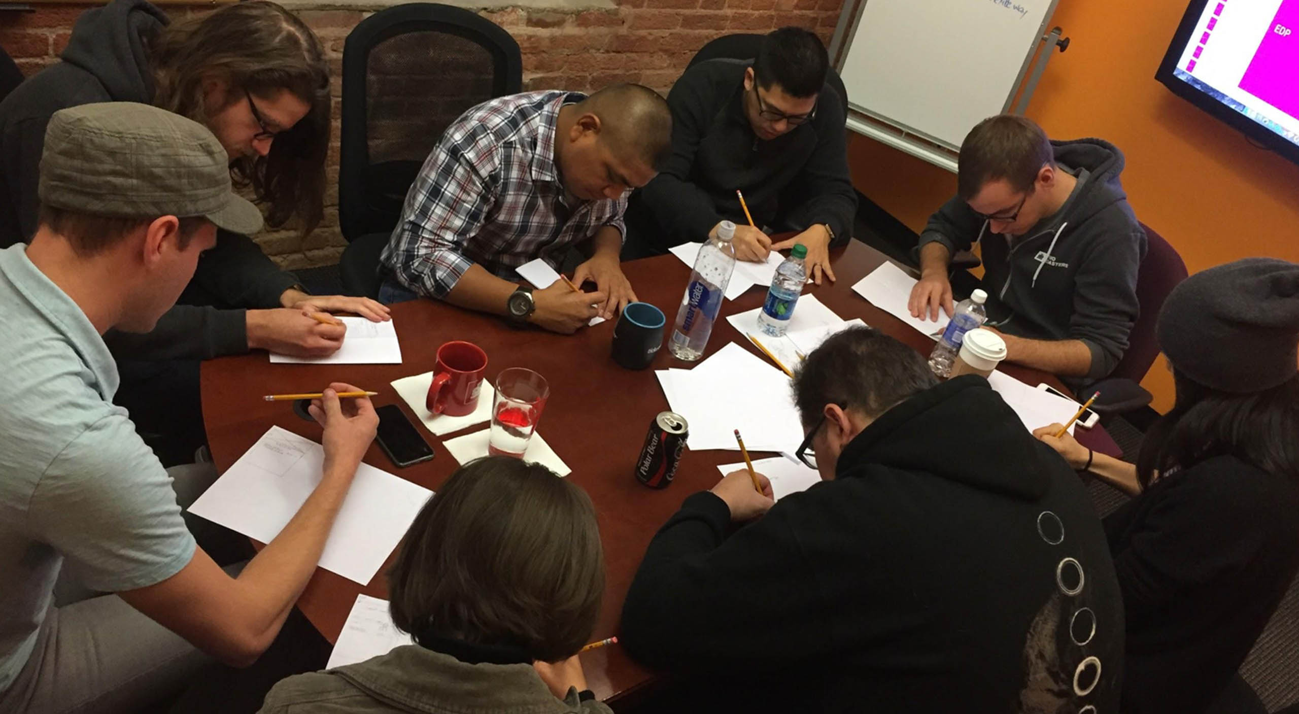
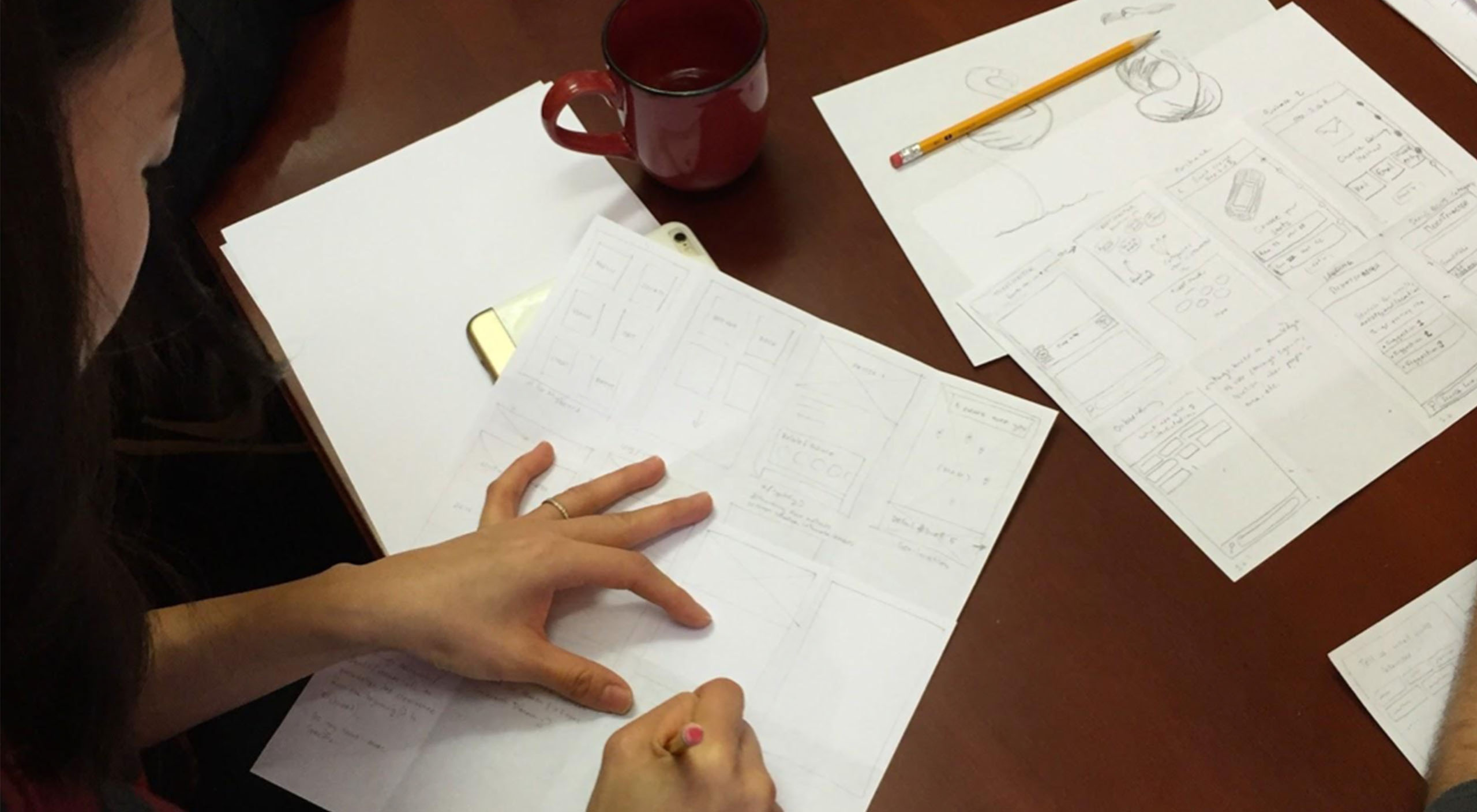
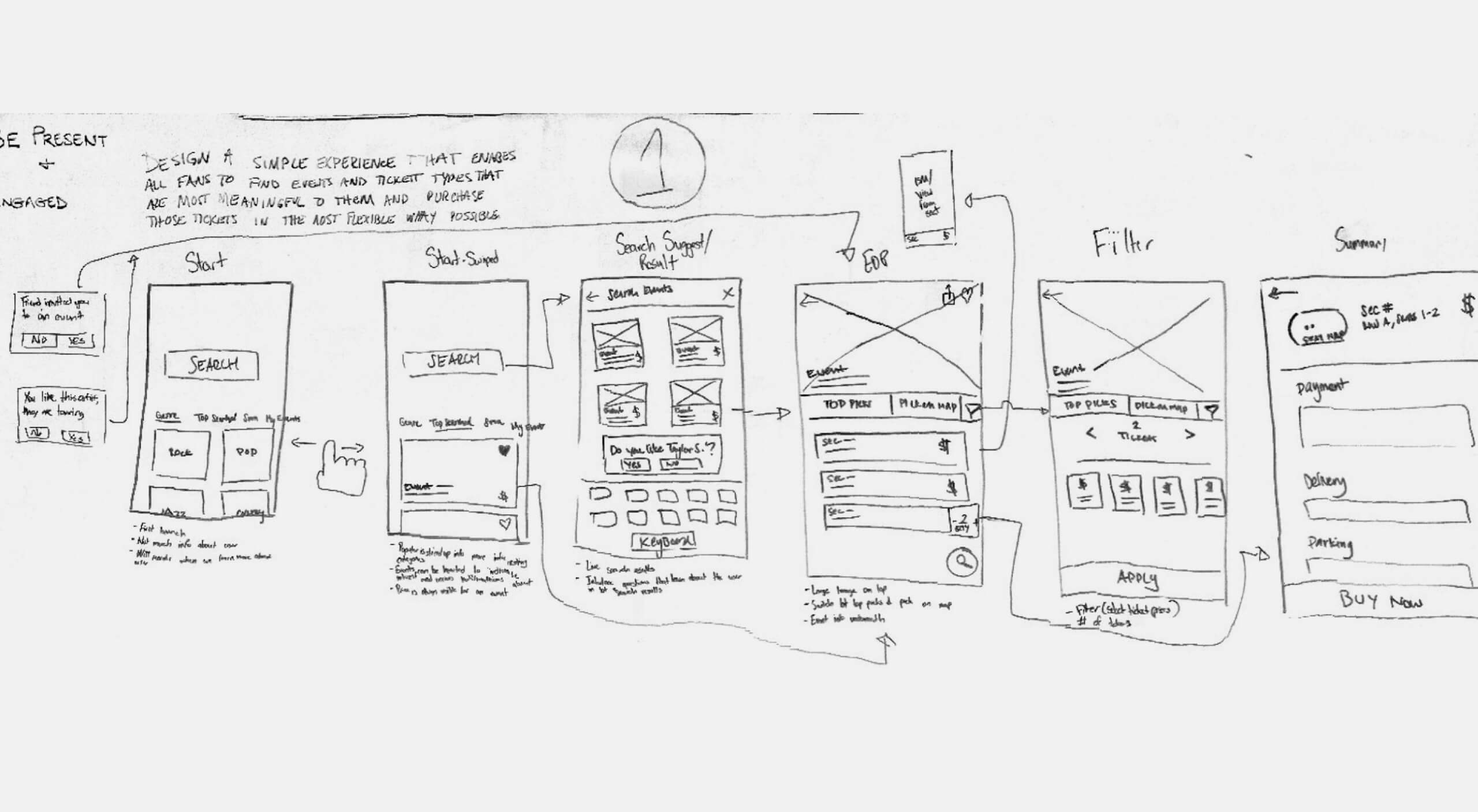
We conducted a series of design studios to sketch out ideas for the new discovery experience, then chose the concept that most closely addressed our goals.
Process
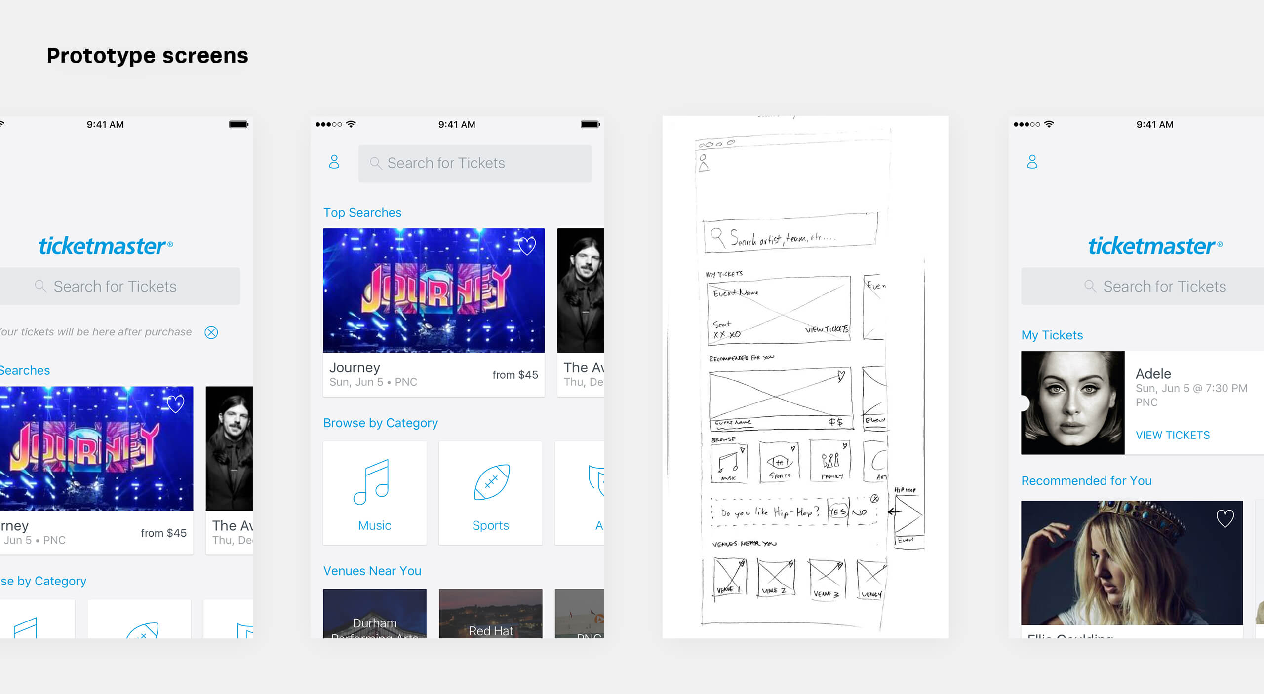
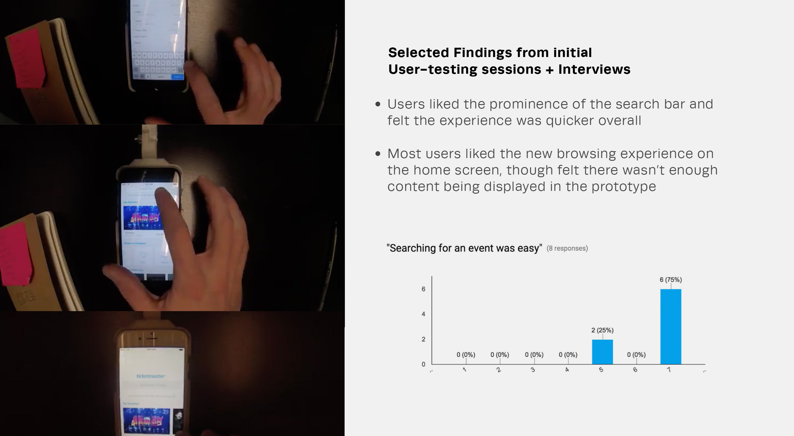
While the developers researched feasibility issues, the design team began to translate the rough sketches and wireframes into high fidelity mockups in order to create a prototype for testing. At the end of the week, we brought in a group of users to try out the prototype and interview about their experience.
Design Challenge
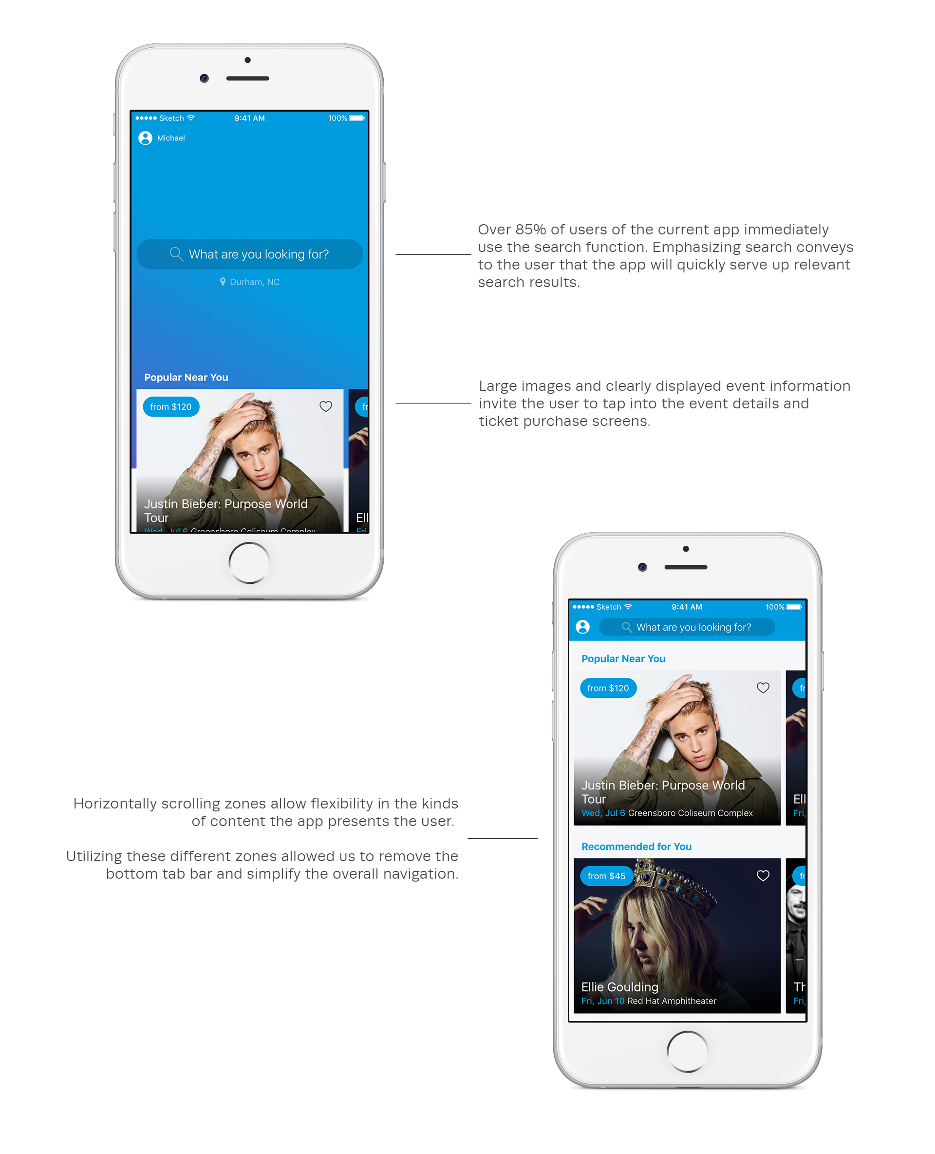
Our task was to re-think the flagship app by designing a streamlined and personalized experience that would enable fans to quickly find events most relevant to them.
Details
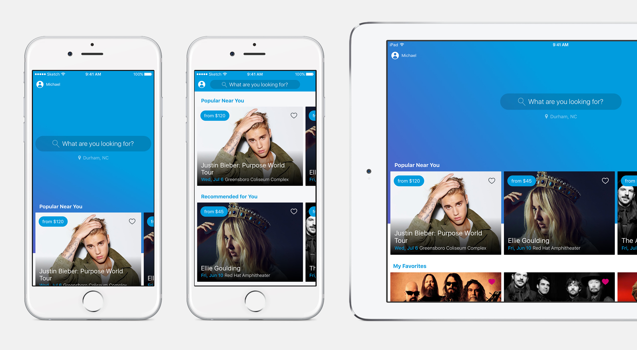
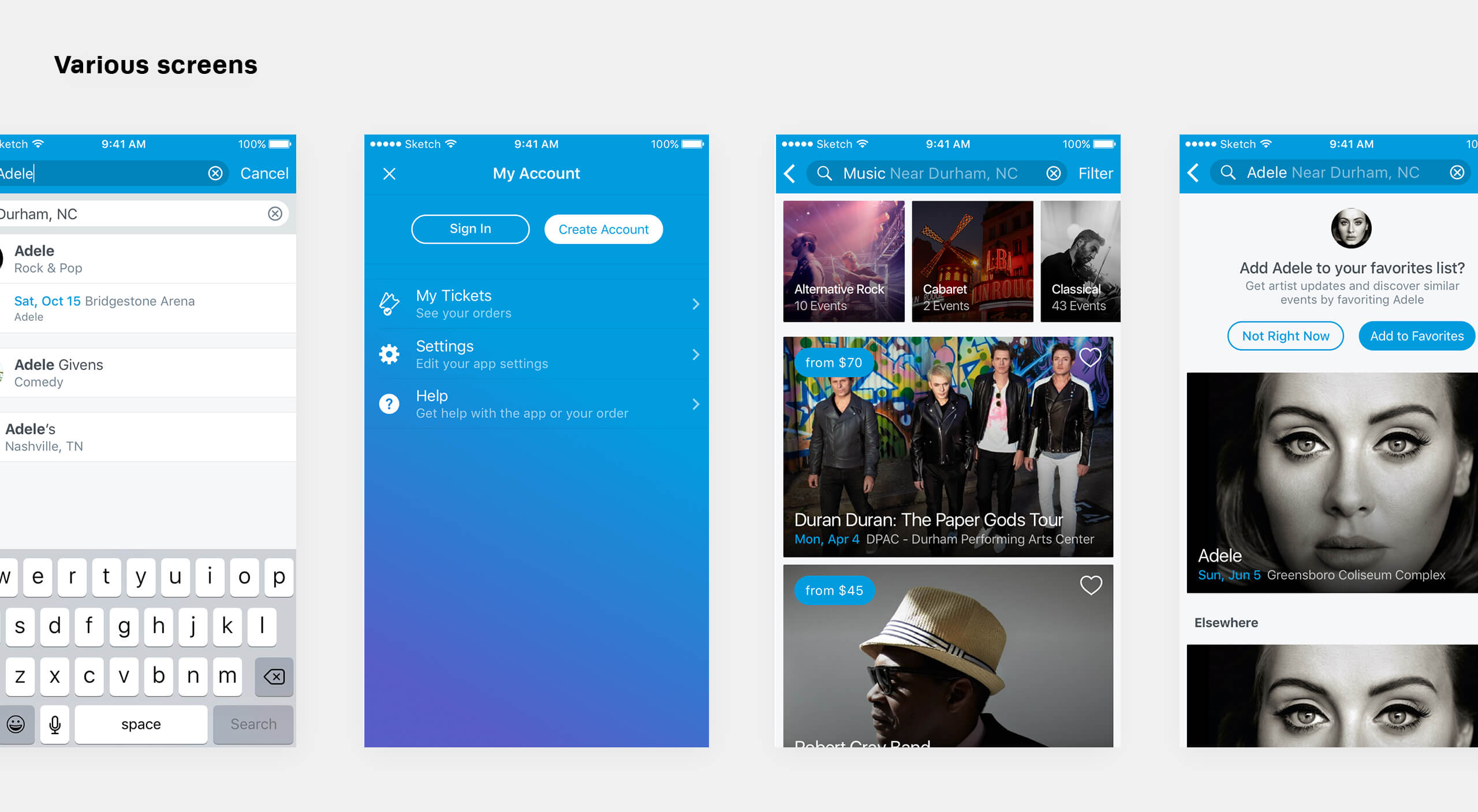
The new design emphasizes search, which is the primary use case for the Ticketmaster app. The new horizontally scrolling zones feature brings a new level of engagement, allowing those who prefer to browse easily find relevant events. This zone framework would enable us to serve up different types of content, such as venue-specific events, favorite artists, or popular nearby events, based on user behavior.
Successes + Setbacks
After getting enthusiastic buy-in from executive leadership upon presentation of the new direction, our team began to flesh out the entire concept. With such a large existing user base, we had to come up with an implementation plan that would allow us to begin rolling out the new design while mitigating risk.
Despite internal restructuring causing progress to slow, we've been able to plan an interim design refresh that will ease the user into the new experience described in this case study. This will also serve as a useful A/B testing framework where we can easily test some of our assumptions.